-01.svg "GGI main logo")


By: Tiago Santana - Founder & CEO, Gray Group International • Serial entrepreneur and growth strategist who has built and scaled multiple companies across technology, media, and consulting. Expert in growth strategist and editorial voice for a global think tank building companies that advance the human experience
Consider a founder who can map a product roadmap in an hour, then freezes in front of twelve white paint samples. That tension is common. Color feels personal, but the real problem is systems. Light shifts, materials react, and one small choice can change how a room supports rest or focus.
The practical answer is simple: don’t start with your favorite color. Start with function, light, and what already lives in the room. Then build a small palette that can survive real life, not just a mood board.
Set the context for color choices
Good color choices begin with use, not taste alone. A room isn’t an isolated image. It’s part of your daily operating environment. That matters if you work from home, recover there after long days, or need one space to support several modes of living.
Many people choose hue too early. They see a photo online, then try to force that result into a different room with different light, flooring, and furniture. The better move is slower at first and faster later. Define what the room needs to do before you decide what it should look like.
Map mood, function, and daily use
Start by asking what state the room should support most often. A bedroom usually needs calm and softness. A dining area may need warmth and conversation. A work corner might need clarity more than comfort. Those are different design jobs.
Mood follows a few simple levers. Lighter values tend to feel more open. Darker ones can feel grounded or enclosing. High saturation feels active and present. Muted color usually feels easier to live with over time. None of those are rules by themselves, but they help you choose on purpose.
Consider a hypothetical home office tucked into a living room. A bright accent wall may look energizing online, yet become distracting during long calls or focused writing. In that case, a quieter wall color and stronger accents through art or textiles often work better.
Assess light, undertones, and room flow
Light changes everything. Morning daylight, late afternoon sun, and evening lamps can make the same paint look clean, yellow, flat, or cold. Before you commit to any color family, watch the room at three points in the day and again under your normal bulbs.
Undertones cause many “wrong color” regrets. Two whites can clash because one leans yellow while another leans blue or pink. The same problem shows up with wood floors, stone counters, rugs, and upholstery. Most rooms don’t fail because the main hue was bad. They fail because the hidden bias underneath it fought the rest of the space.
Room flow matters too. A home should feel connected as you move through it. That doesn’t mean every room must match. It means transitions should feel intentional. Repeating one neutral anchor across major surfaces often does more for flow than repeating one accent color everywhere.
Choose a palette that works hard
A strong palette does more than look good on day one. It helps rooms relate to each other, gives changeable items room to evolve. Lowers the risk of expensive rework later.
Most homes need fewer colors than people think. One dependable neutral anchor, one or two supporting hues, and one accent color is often enough. Texture can do the rest (and texture matters more than trend boards suggest).
Build coherence across rooms worldwide
Coherence comes from restraint and repetition, not sameness. Keep one base note steady across connected spaces. That might be wall color, flooring tone, wood finish direction, or upholstery temperature. Then allow each room to shift its emphasis based on use.
Natural palettes tend to age well for a reason. They usually mix soft variation in tone with low to medium saturation. Think clay against linen, deep green against warm wood, or charcoal against off-white plaster-like walls. The lesson isn’t “choose earth tones.” It’s “limit intensity and vary texture.”
For homes shaped over time, use portable color first. Rugs, curtains, cushions, throws, lampshades, and artwork let you test direction without locking yourself into it. That approach also respects how many people actually furnish homes: in stages rather than all at once.
Test samples before paint and textiles
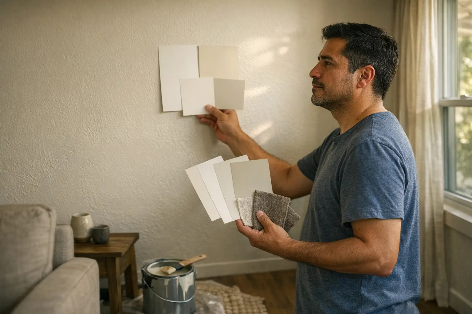
Always test at scale before you commit. A tiny swatch hides too much information. Paint larger sample areas on more than one wall if possible, especially where light changes most across the day.
Textiles need testing too. Fabric seen online can shift sharply once it sits next to your floor or sofa under home lighting. Order samples where possible and place them beside fixed elements for several days. Fast decisions here often create slow regret.
One useful discipline is comparison testing rather than single-sample testing. Don’t ask whether one option looks good alone. Ask which option behaves best morning to night next to the things you already own.
Measure impact over time
The right color choice should still make sense after novelty fades. That means weighing maintenance, replacement cycles, indoor comfort, visual access. How likely you are to live with the decision instead of redoing it soon.
That longer view fits how Gray Group International thinks about design broadly: environments should improve daily life rather than simply decorate it. At home, that means judging color by performance as well as appearance.
Weigh sustainability, durability, and emissions
Sustainability in decor usually starts with staying power. A finish that wears well and still suits you years later is often better than a trendy choice you repaint quickly because it never felt settled.
Look closely at product labeling for paints, coatings, textiles, and treatments. Bedrooms and enclosed rooms deserve extra care if odors linger or airflow is limited. Material choices affect comfort after installation, not just during purchase day.
Durability also shapes visual success. Matte finishes can soften glare and hide wall flaws well. Higher-sheen surfaces reflect more light but may show imperfections faster. Neither is always right or wrong. Match sheen to wall condition, cleaning needs, and how hard that surface works each day.
Talk to Gray Group International
Reading is cheap. Changing how an organization actually operates is not, and that gap is exactly where Gray Group International earns its keep. We help teams translate what they have learned about this topic into a sequence of decisions, owners, and checkpoints that survives contact with next quarter's priorities. If you want a sounding board before you commit budget or people, reach out and compare notes.
You Might Also Like
Discover more insights in Lifestyle, our full collection of articles on this topic.
Join Disruptors Digest
Insights for a future worth creating. Sustainability, lifestyle, business, and beyond.
Gray Group International is a growth studio helping businesses attract, convert, and retain customers. Our consulting arm, gardenpatch, offers hands-on playbooks and strategy sessions.
